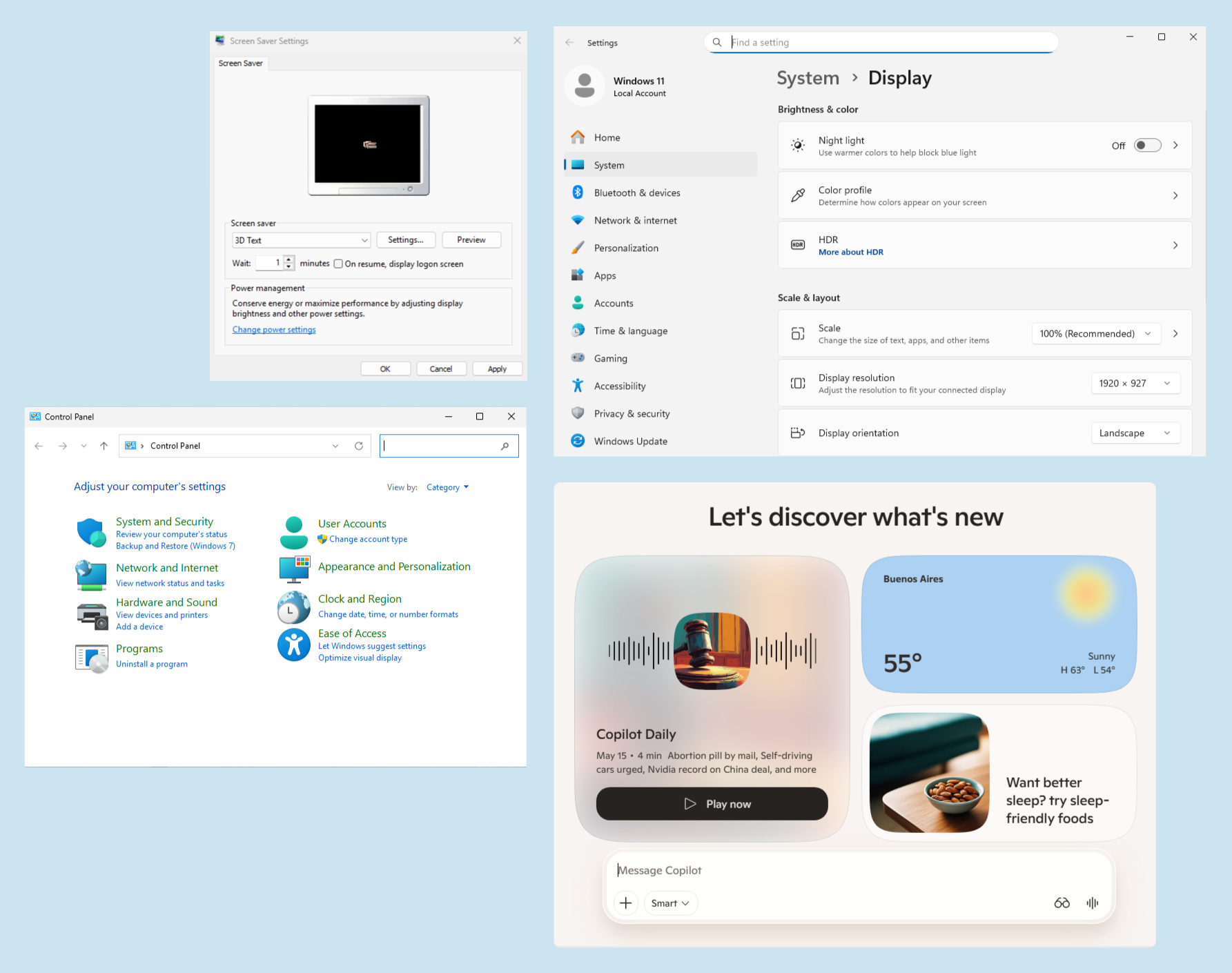
Open Windows 11 today and the contradiction is immediately visible. Settings looks modern, soft and carefully designed. Disk Management looks like it escaped from another century. Screen Saver Settings still feels like Windows XP. The Copilot app belongs to another visual world entirely. That tension says a lot about Microsoft’s long search for a visual identity.
I came across a long thread by Steven Sinofsky, former head of Windows at Microsoft, tracing the history of Windows APIs across four decades. It’s a dense, technical read, full of insider references. But behind all the talk about COM, OLE, and Win32, there’s a design story hiding in plain sight.
Every time Microsoft changed how developers built software, the way Windows looked changed too.
The platform and the aesthetic were never really separate things. This happens in every major OS ecosystem. Apple has its own visual grammar, from Aqua to Liquid Glass. Google has Material You. GNOME has a very clear idea of what a desktop should feel like.
Windows, meanwhile, has often struggled to decide what version of itself it wants to be.
The Era of Constraints
Back in the late eighties and early nineties, Windows had a very specific visual style. Gray backgrounds, beveled buttons, raised borders, chunky scrollbars. It wasn’t really a deliberate design choice. It was a technical one. The GDI, or Graphics Device Interface, had limited capabilities, and what you saw on screen was essentially the best those tools could produce.
Nobody talked about design systems back then. But Windows 3.x had one anyway, born out of necessity. And because every developer was working with the same limited visual toolbox, apps looked remarkably consistent with each other.
That constraint driven coherence is something Microsoft has never quite recovered.
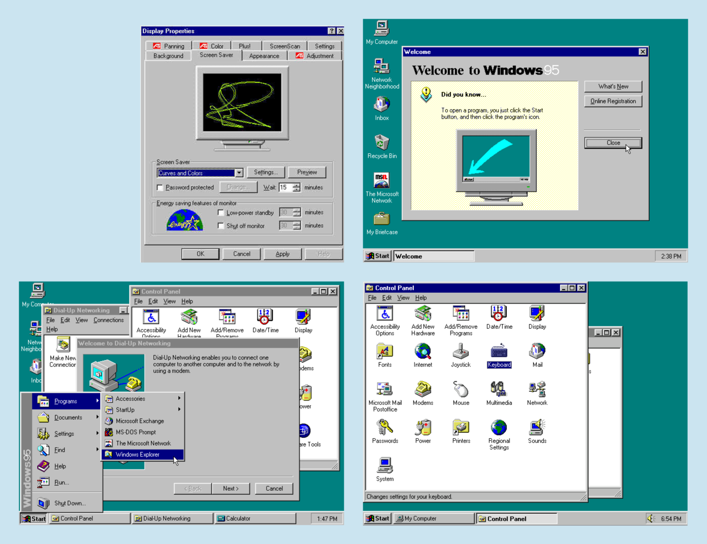
Windows 95 and the First Real Identity
With Windows 95, Microsoft made a deliberate visual leap. The taskbar, the Start menu, the desktop with icons, all these features that made the UI consistent and straightforward. This was the first time Windows felt like it had been designed, not just assembled.
There was a clear logic to it. Flat panels were still beveled, but with more depth. Icons had personality. The system had a rhythm. For a lot of people, this is still what “Windows” looks like in their heads, even today.
It wasn’t perfect, but it was coherent. You knew where you were.
When Technical Fragmentation Became Visual Fragmentation
This is where things started to get complicated. As Windows development spread across different frameworks, controls and custom UI libraries, apps stopped looking like they came from the same place. Developers were no longer building from the same visual toolbox, and that fragmentation inevitably showed up on screen.
Some apps used native controls, others had custom toolbars, and many started to develop their own visual language inside Windows. Some looked sharp and professional, while others looked like they came from a different operating system entirely. This was the era of apps that didn’t quite fit together. You’d switch from Word to a third-party utility and feel like you’d traveled to another country.
The interesting thing is that this wasn’t only a design problem. It was the visible result of a platform that had become harder to unify. Once the underlying development model became fragmented, the visual identity followed the same path.
Windows XP Luna: Confidence and Excess
Luna, the design system introduced with Windows XP in 2001, was Microsoft’s most ambitious visual statement up to that point. The glowing green Start button, the blue gradient title bars and the candy-like icons made Windows feel friendlier, louder and more consumer-oriented. It was bold, almost aggressive in its cheerfulness.
People either loved it or switched it off immediately and ran the classic theme. I was definitely in the second group.
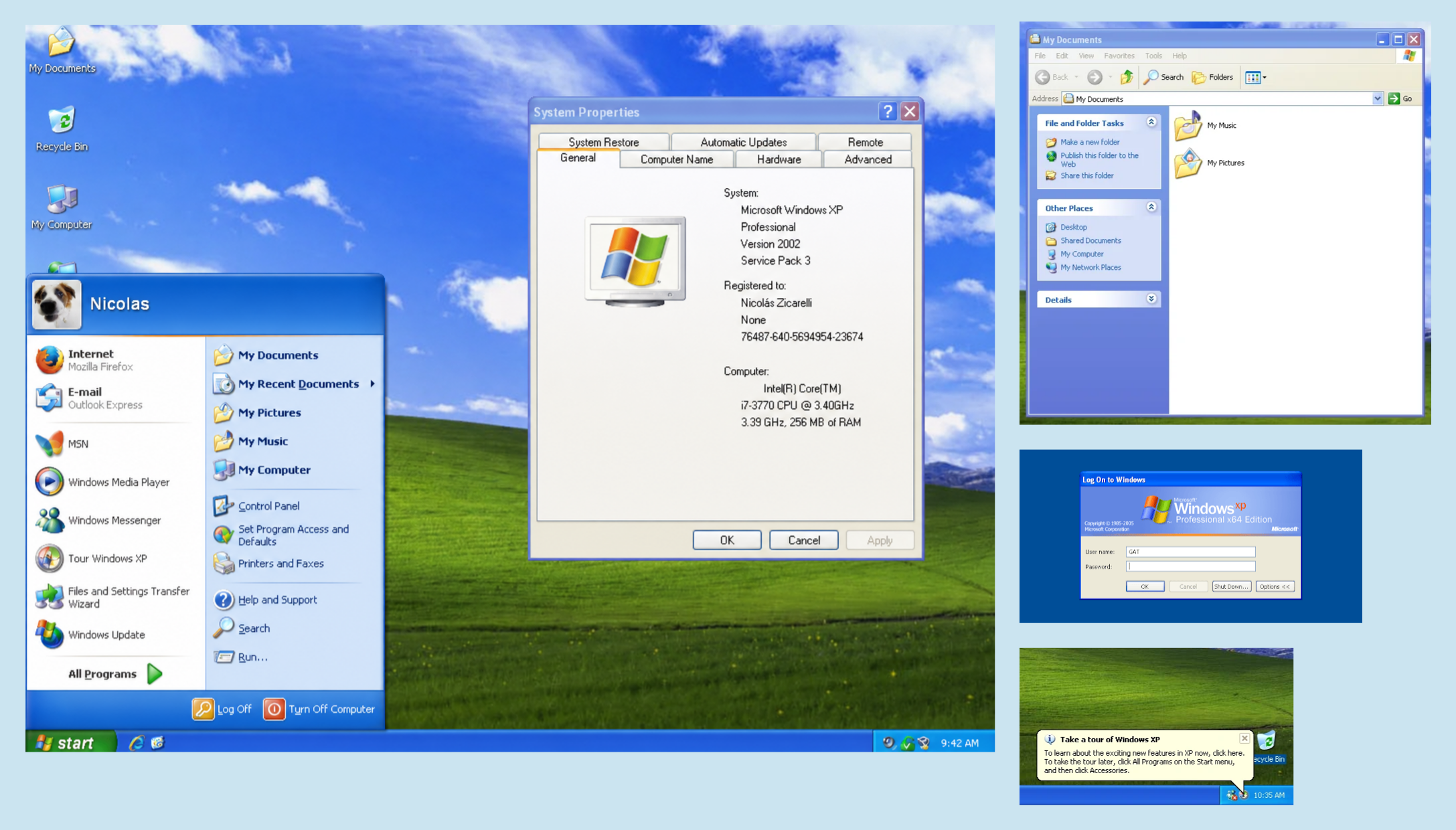
But here’s the thing: Luna existed. It had a point of view. Microsoft was confident enough to say “this is what Windows looks like,” even if that statement was a bit too loud for some. Looking back, Luna was trying to give Windows a recognizable personality.
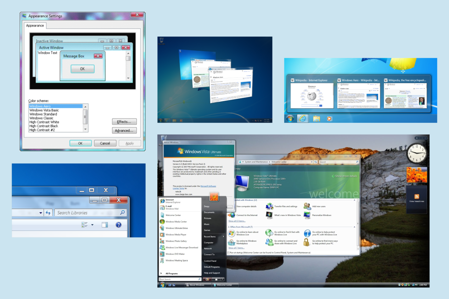
Aero: The Peak
Windows Vista and Windows 7 introduced Aero, probably the most refined design language Windows ever had. Translucent title bars, subtle glass effects, smooth animations and a more consistent icon set made Windows feel premium in a way that no previous version had managed to do.
Aero also had real technical ambition behind it. It was powered by desktop composition through the Desktop Window Manager, which allowed Windows to render transparency, animations and visual effects in a more modern way. Around the same period, WPF (Windows Presentation Foundation) gave developers a more ambitious framework for building Windows interfaces, but the broader ecosystem never fully moved there. Once again, Microsoft’s own visual direction and the reality of third-party apps started drifting apart.
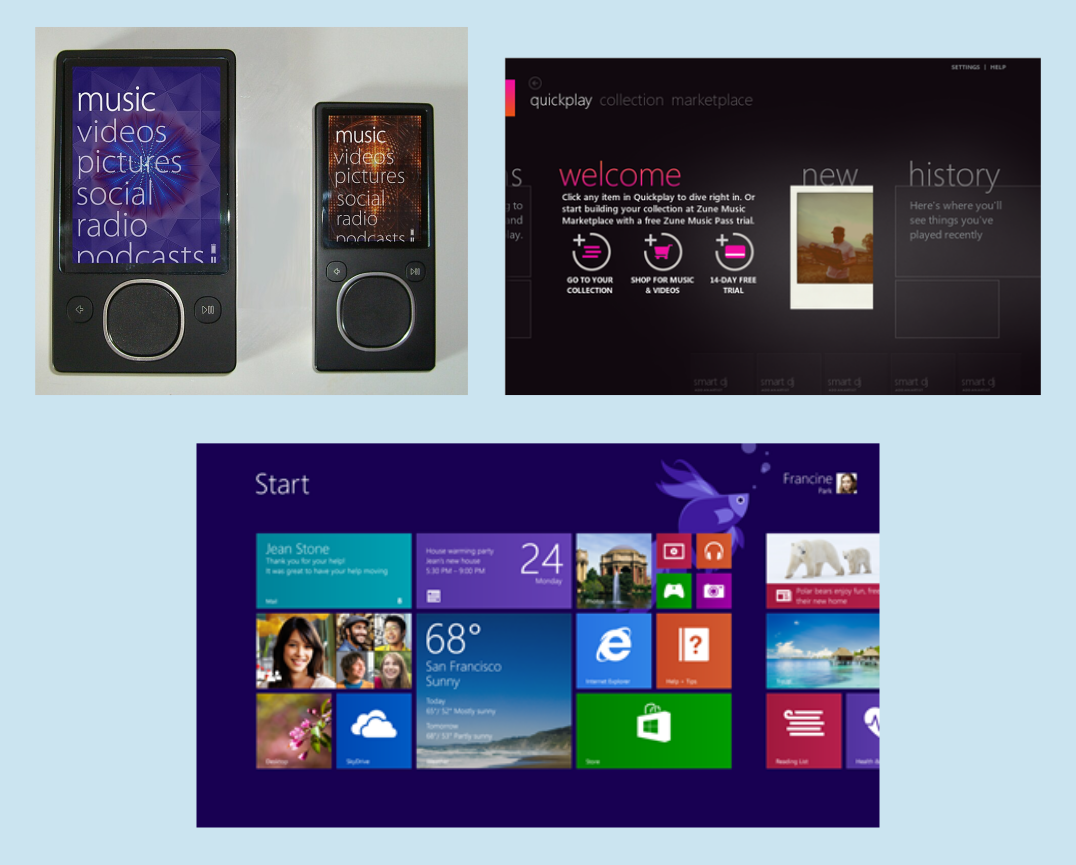
Metro: The Most Interesting Bet
Metro UI was first introduced during the Zune era, before reaching Windows Phone and later Windows 8. It was a radical change: clean typography, flat colors, content over chrome, big grids, generous spacing and a layout language inspired more by Swiss graphic design than by traditional desktop metaphors.
I remember back in 2012, when I was working at a marketing agency for Microsoft, praising this design language and bringing it up in internal design meetings. Later on, the ill-fated Windows 8 launched, and it became clear that Metro was Microsoft’s new gold standard.
As a designer, I still have a lot of respect for Metro. It had a genuine idea at its core: the content is the interface. No gradients, no bevels, no decorative noise. Just information, typography and structure.
Windows 8 failed commercially. But the reasons for that failure were mostly platform-level: the confusion around touch versus mouse, the awkward split between Modern apps and the legacy desktop, the missing Start menu. The design language itself wasn’t the problem.
Fluent Design: A Catalog Without a Vision
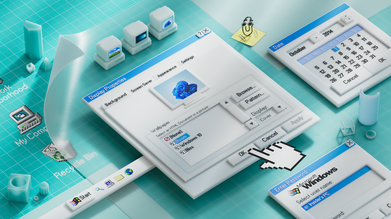
And then there’s Fluent. Introduced with Windows 10 and carried forward into Windows 11, Fluent Design is Microsoft’s current answer to the question of visual identity. It has documentation, a dedicated website, named materiales like Acrylic and Mica, motion principles and a relatively complete component system.
But I find it hard to describe what Fluent stands for. Aero stood for premium and depth. Metro stood for clarity and content. What does Fluent stand for? Rounded corners? Blur effects? Softer surfaces? It often feels like a collection of aesthetic decisions without a unifying idea underneath them.
The problem is especially visible in Windows 11. Open Settings or the Copilot app and you’ll see the new Fluent language in full effect: rounded corners, Mica backgrounds and clean layouts. Then open Disk Management and you’re looking at a dialog that has barely changed in decades. Open Screen Saver Settings and you’re greeted by a window that feels like Windows 2000. All of these exist in the same operating system, in 2026.
There’s a structural reason for this. Windows 11 wasn’t built from scratch: it grew out of work done for Windows 10X, a stripped-down version of Windows designed for dual-screen devices that was later cancelled. When Microsoft decided to move forward with a new version of Windows anyway, it took part of that work and layered it on top of Windows 10.
The new shell is real, and the new design language is real. But underneath it, the skeleton is still old Windows. The inconsistencies aren’t just accidents or laziness. They are the visible patches of a platform that has been evolving for decades without ever being fully rebuilt.
Sinofsky’s thread argues that Microsoft lost clarity at the platform level many times over the years. I’d argue that every time that happened, visual incoherence followed naturally. Fluent is a symptom, not a cause. When you’re not sure what your platform is, you can’t be sure what it should look like.
I’ll admit I’m biased here: I use macOS and Fedora Workstation, with vanilla GNOME, as my daily drivers, and I find both of them remarkably consistent and polished across apps. Not perfect, of course, but they usually feel like systems that know what they want to be. macOS has a strong visual tradition. GNOME is opinionated, sometimes too much, but that opinion gives it consistency. You can disagree with the direction, but at least there is a direction.
Windows 11, for all its documentation and named materials, still doesn’t give me that feeling. It often feels like several generations of Windows sharing the same apartment.
What’s Next
Microsoft is now pushing AI heavily into Windows. Copilot, Recall, semantic search and integration points everywhere. It’s probably the biggest platform bet since Windows 8, and it carries a similar energy: a fundamental rethinking of what the operating system is for.
Whether that clarity of purpose will translate into a clearer visual identity remains to be seen. So far, the AI features feel grafted onto Windows rather than native to it. The design language hasn’t caught up yet.
Maybe that’s fine for now. Platform transitions take time. But if history is any guide, Microsoft’s design language will only find its footing once the underlying platform finds its own.
Windows doesn’t need another design system. It needs to decide which version of itself it wants to be.
Useful links
- One Softie’s View of the Evolution of Windows AP
Steven Sinofsky’s original thread that inspired this post. - Hardcore Software (Sinofsky’s Substack)
Deep dives into the history of Microsoft from someone who was there. - Fluent Design System
Microsoft’s official design language documentation. - The History of Metro Design Language
A useful overview of the design language introduced with Windows 8. - Windows11 está muriendo
A critical look at Windows 11’s fragmented identity and the technical debt behind its visual inconsistencies. In Spanish. (Tecnonauta, YouTube)


